Project: EDITORIAL
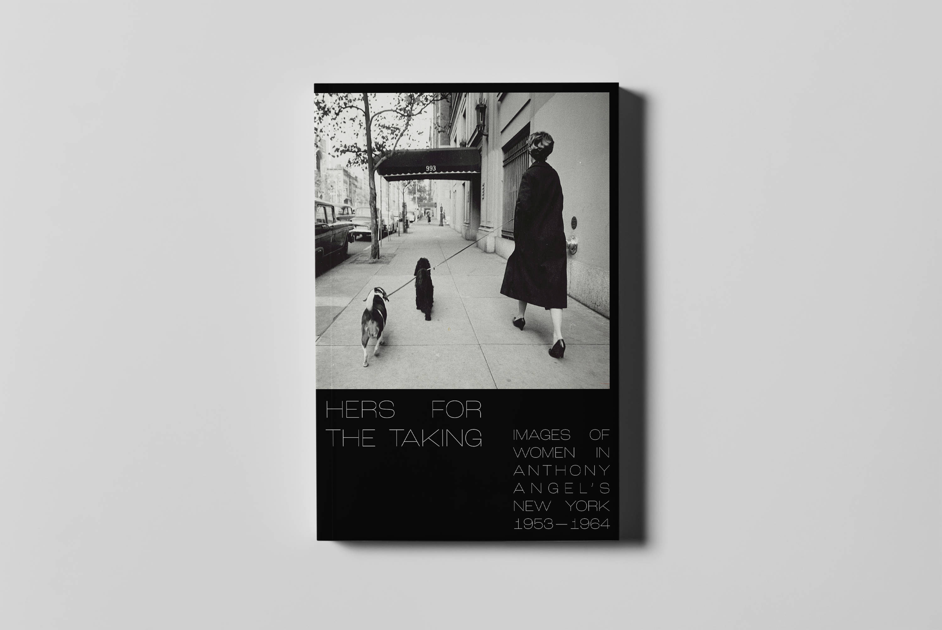
Title: HERS FOR THE TAKING
Subject: PHOTOGRAPHY, ART, HISTORY
Concept, Design, Writing, Layout, Typesetting
Title: HERS FOR THE TAKING
Subject: PHOTOGRAPHY, ART, HISTORY
Concept, Design, Writing, Layout, Typesetting
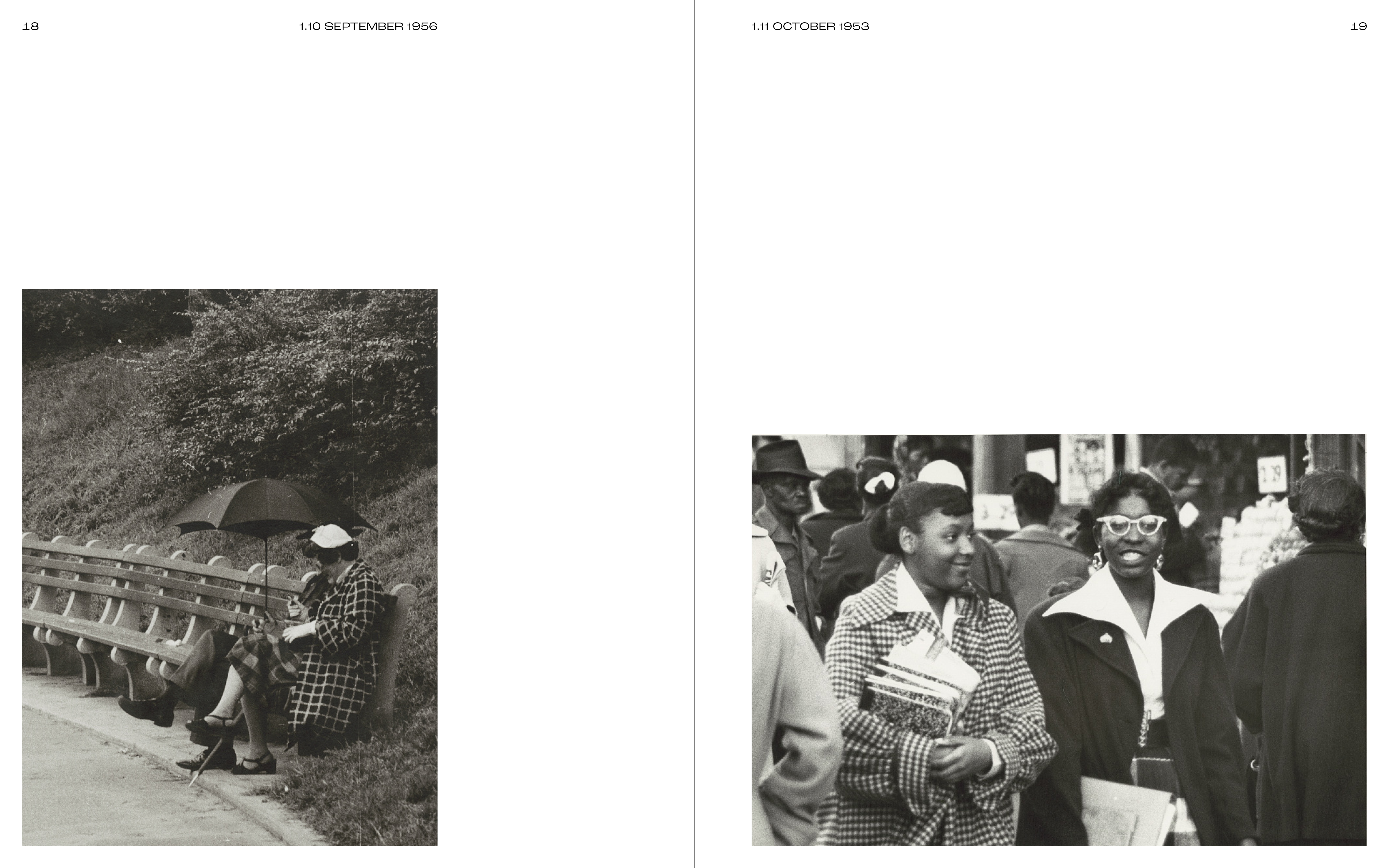
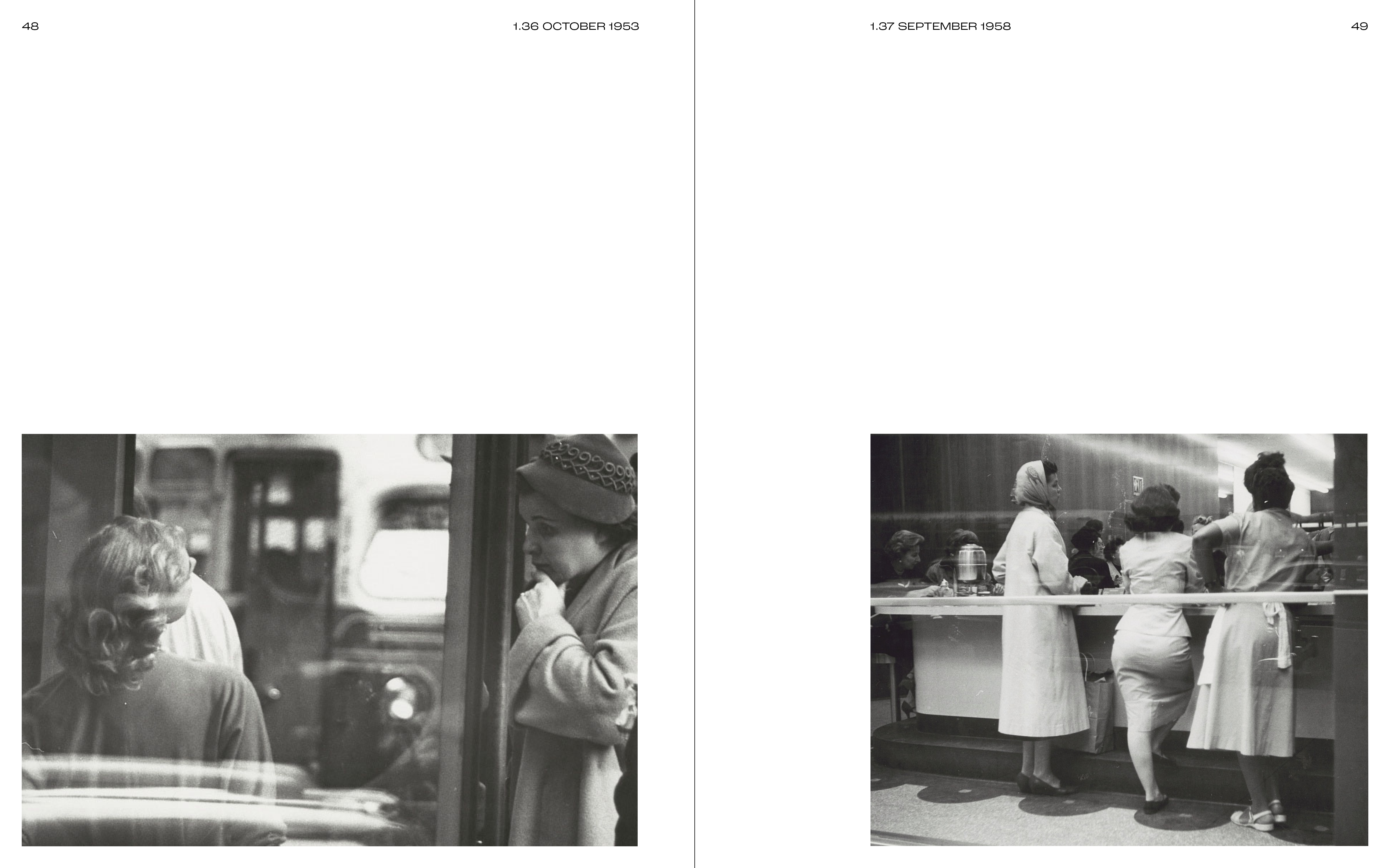
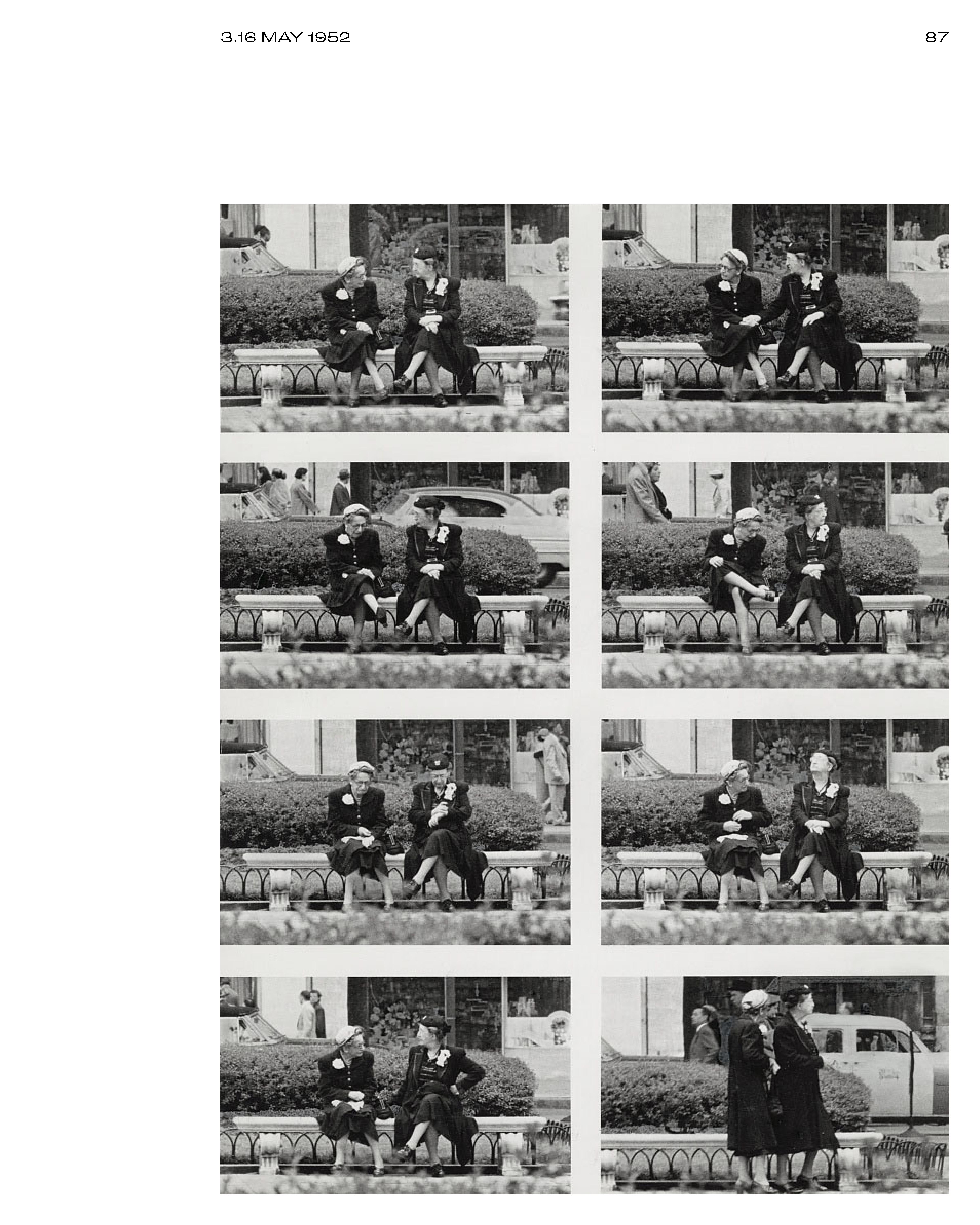
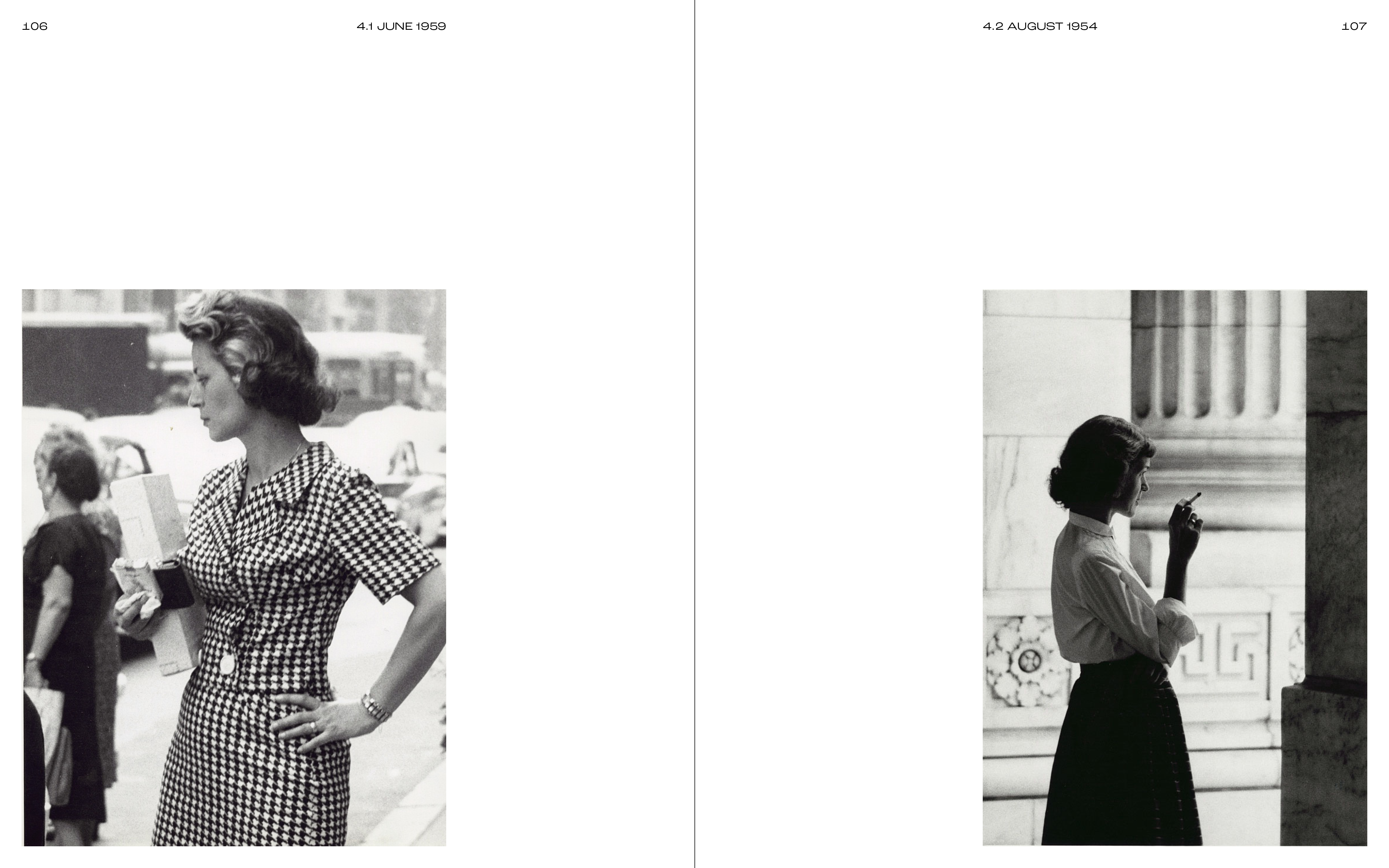
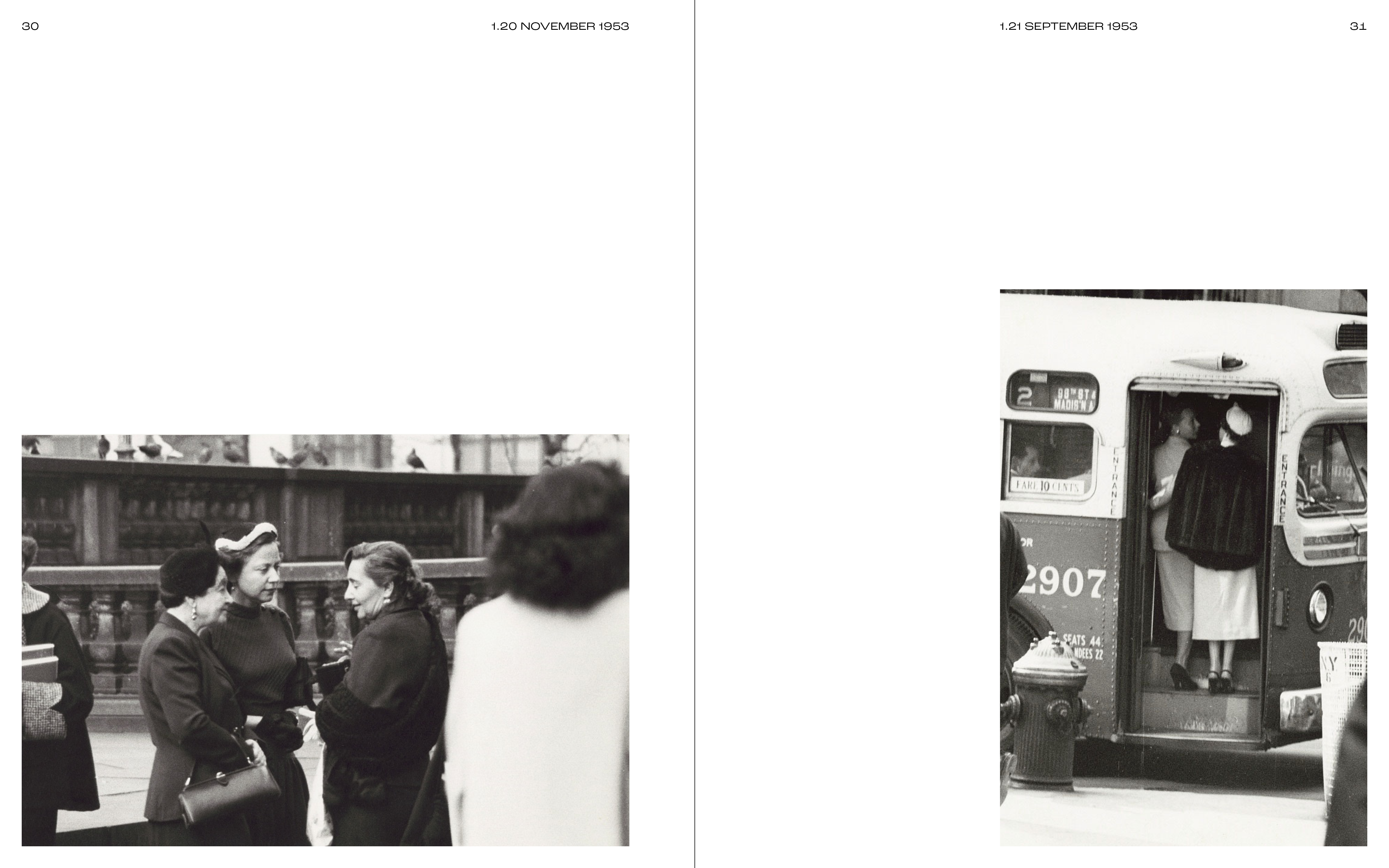
This image heavy project took the recently digitized works of NYC street photographer Anthony Angel (available via the Library of Congress) and compiled them into a 180-page printed book ‘Hers for the Taking: Images of Women in Anthony Angel’s New York 1953-1964’.
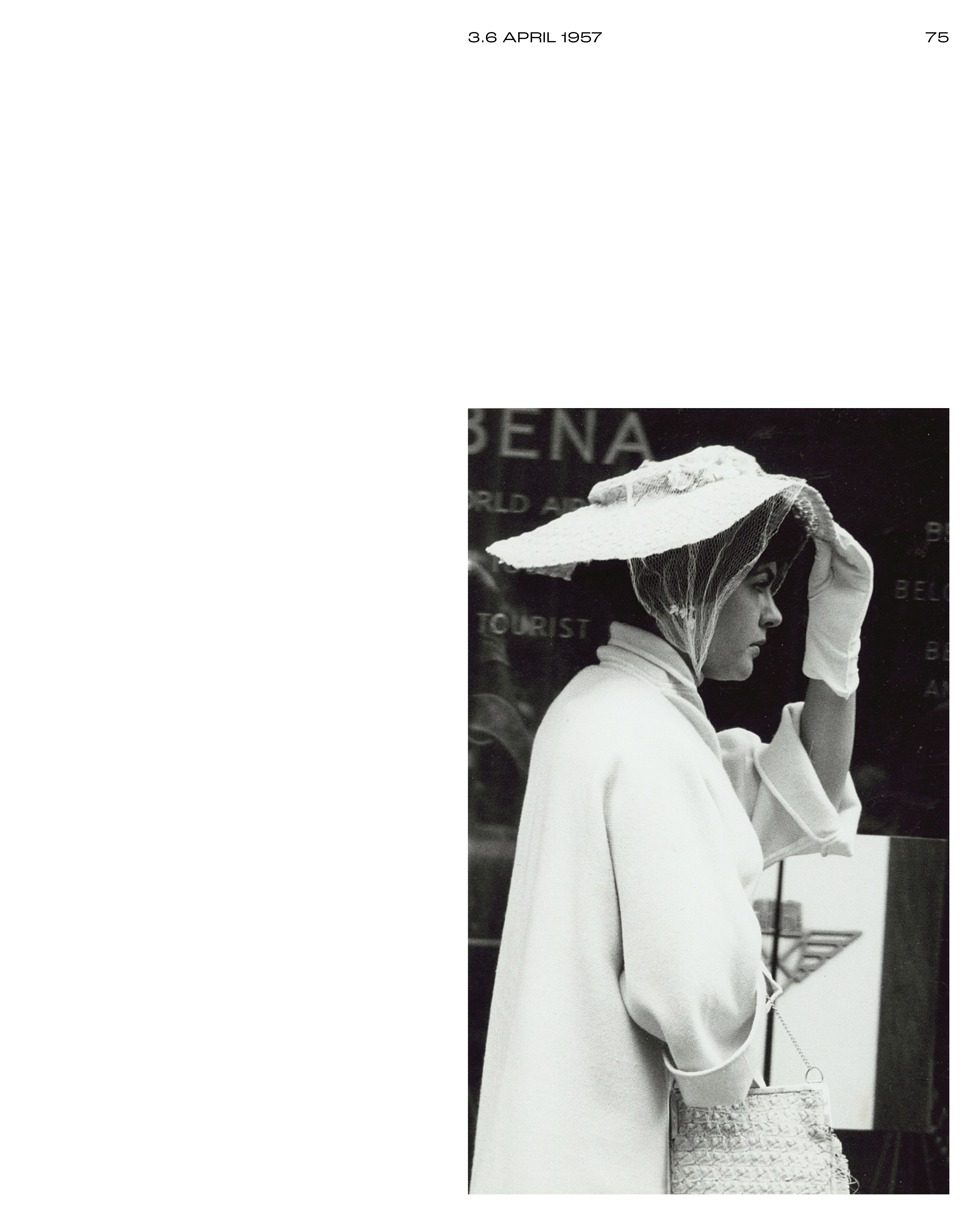
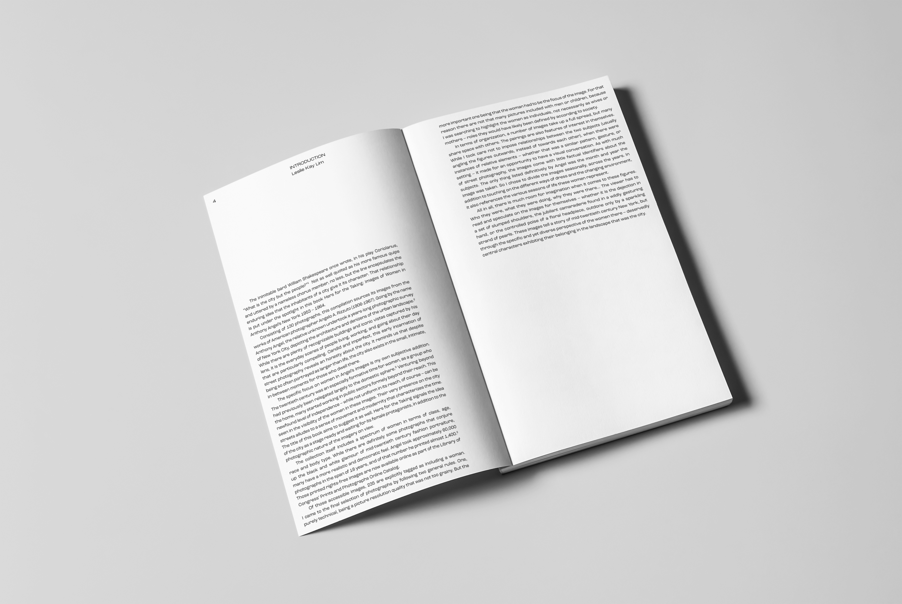
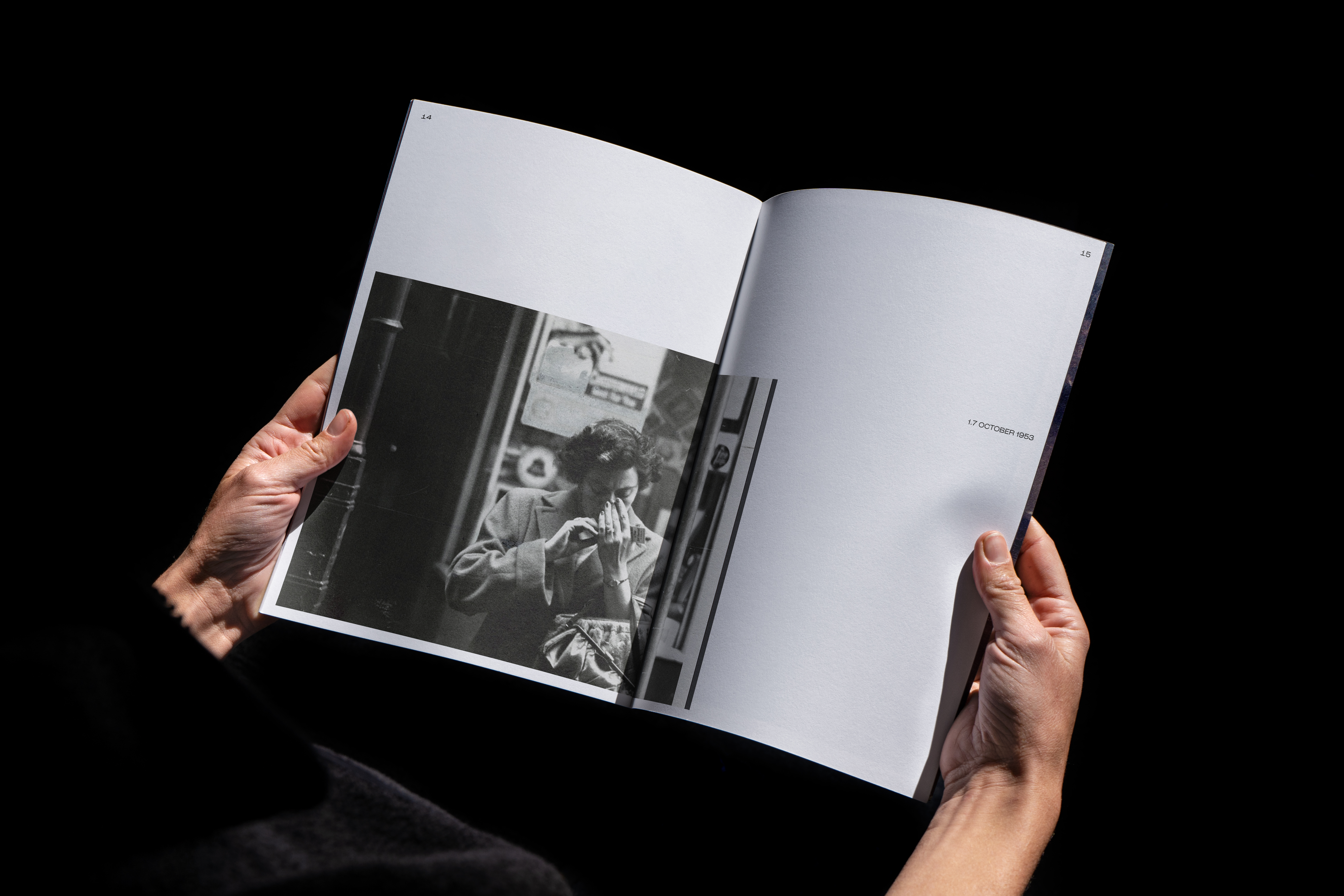
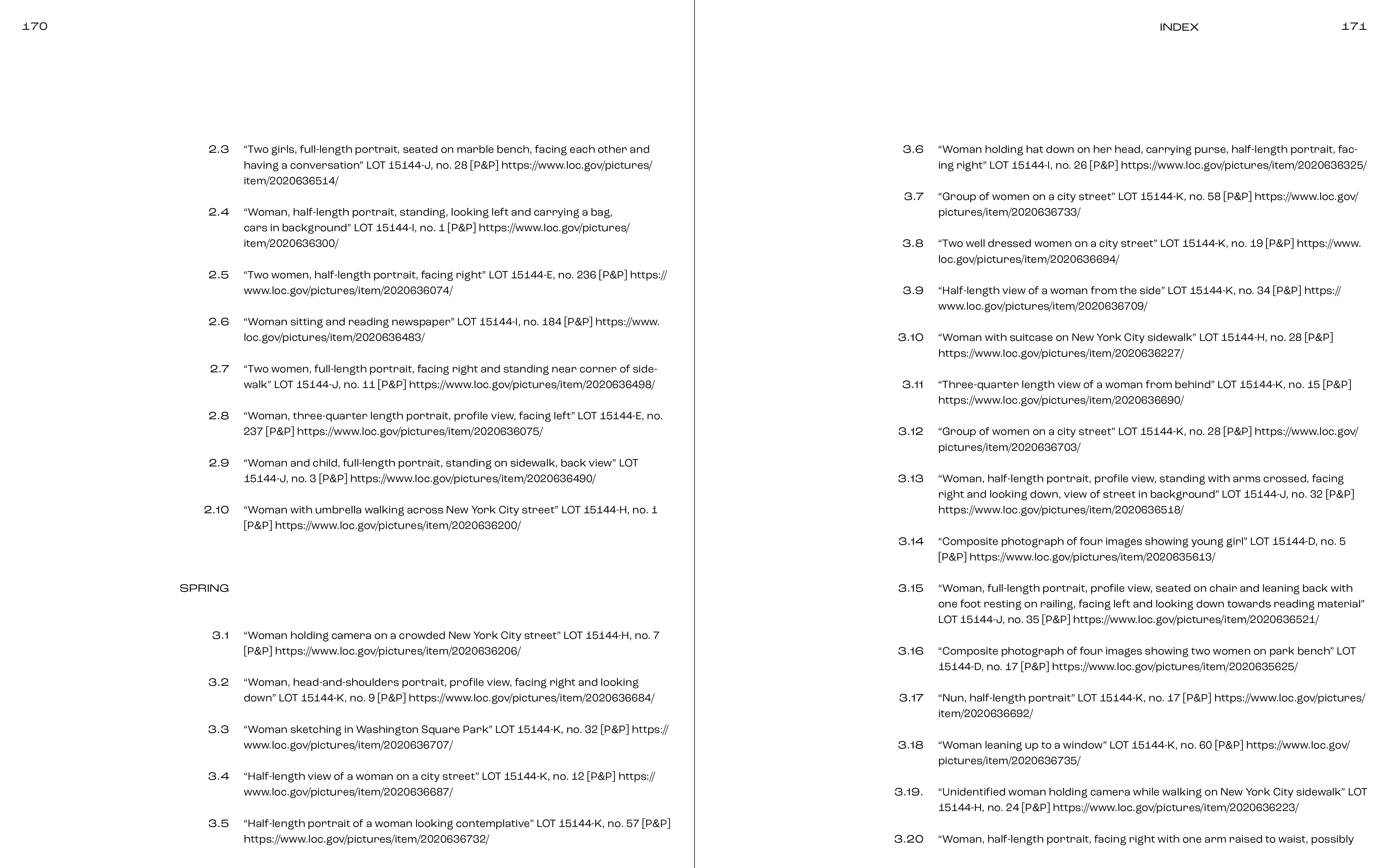
In addition to writing an introductory essay on the growing visibility of women in the city in the mid-20th century, I selected 130 images to feature. The book was organized seasonally, reflecting both the changing environment and attire. And instead of cluttering the page with additional archival information, I created a numerical key for each image with a corresponding index in the back.
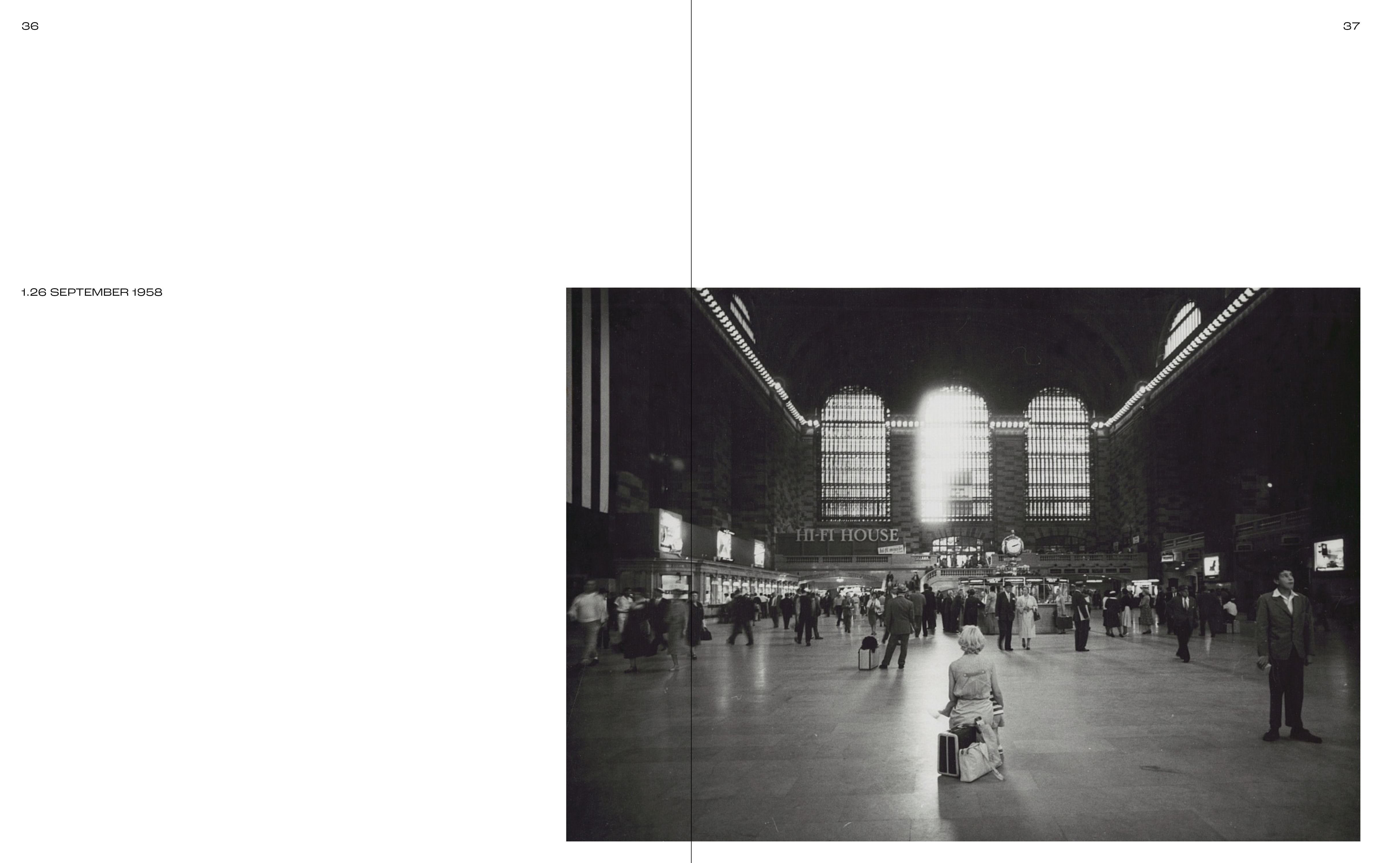
I paired together some images that had similar visual elements (a pattern, an accessory, a composition, etc) and used full page spreads to single out particularly compelling photographs. Captions were aligned to the photograph’s edge, which in turn were standardized from the various original sizes to fit within a new gridded system.
Roc Grotesk Wide was utilized throughout to achieve the book’s specific feel. The typeface hinted of elegance, but also projected strength and took up space. Much like the women the photographs immortalize.
